Digitizing-features-from-an-allmaps-georeferenced-map
Workshop Tutorial: Digitizing French Ports and Railroads in ArcGIS Online (Individual User)
goto.stanford.edu/paper2points
Introduction
This tutorial will guide you through creating an ArcGIS Online application for digitizing ports and railroads using a historical map of French ports and railroads. The goal is to convert key features from the map into geospatial data. This version is designed for individual users working independently.
About the XYZ Tiles
The map used for this digitization task is accessible as an XYZ tile layer via a IIIF manifest. This setup enables viewing and digitizing the historical map within ArcGIS Online.
What are XYZ Tiles?
XYZ tiles are a web standard for displaying maps on the internet. Instead of sending one giant image, maps are divided into small square tiles (typically 256×256 pixels) organized in a grid. Each tile is identified by three coordinates:
- X = horizontal position (column)
- Y = vertical position (row)
- Z = zoom level (how far in or out you are viewing)
For example, at zoom level 1, there are only 4 tiles (2×2 grid). At zoom level 10, there are over 1 million tiles! Your browser only loads the tiles you can see, making maps fast and responsive. This is why Google Maps, OpenStreetMap, and most web maps use this format.
What is a IIIF Manifest?
IIIF (International Image Interoperability Framework) is a standard that allows libraries, museums, and archives to share high-quality images online. A IIIF manifest is a structured file (in JSON format) that describes an image or collection of images, along with metadata. Tools like Allmaps.org can read this manifest and convert the historical map into XYZ tiles so you can use it in GIS applications.
Relevant Links
- IIIF Manifest URL:
https://purl.stanford.edu/zc368qw3281/iiif/manifest - Viewer Link:
Stanford Digital Repository Viewer
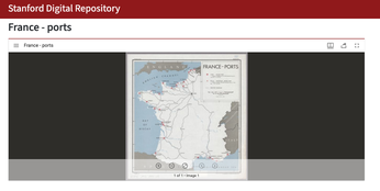
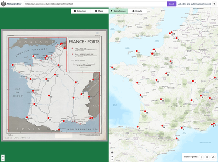
- Allmaps Editor Link: View and edit the map georeferencing for the map we are working with).
- Allmaps Results Page:
https://allmaps.xyz/maps/560151a07e32b2e1/{z}/{x}/{y}.png
Step 1: Login to ArcGIS Online
- Open a web browser and navigate to Stanford’s ArcGIS Online Org: https://stanford.maps.arcgis.com
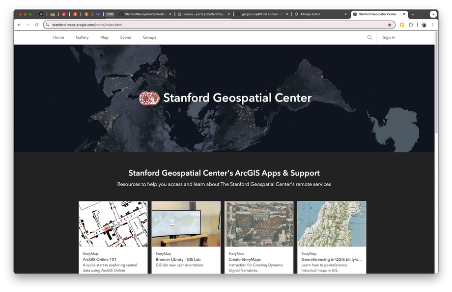
- Click Sign In.

- Click the blue Stanford University button
- You should be redirected to Stanford’s Single Sign-On (SSO) page. Use your Stanford SUNetID and password to log in.
Step 2: Create a New Feature Dataset
What is a Feature Layer?
A feature layer is a dataset that stores geographic features (points, lines, or polygons) along with their attributes (data). For example, a point represents a port location with attributes like port name and type. Feature layers are the core of GIS—they’re where your actual data lives. You’ll create two feature types here: points for ports and lines for railroads.
- Click Content in the top menu.
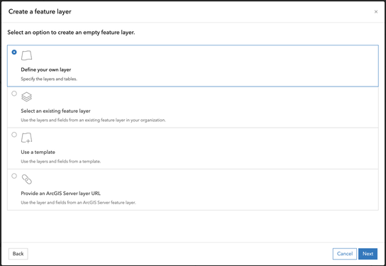
- Select New Item → Feature Layer → Define Your Own Layer.
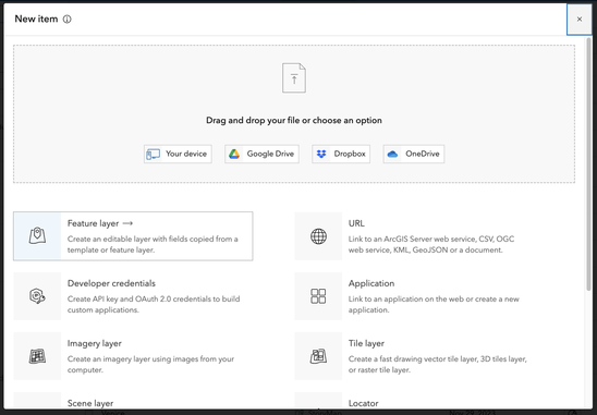
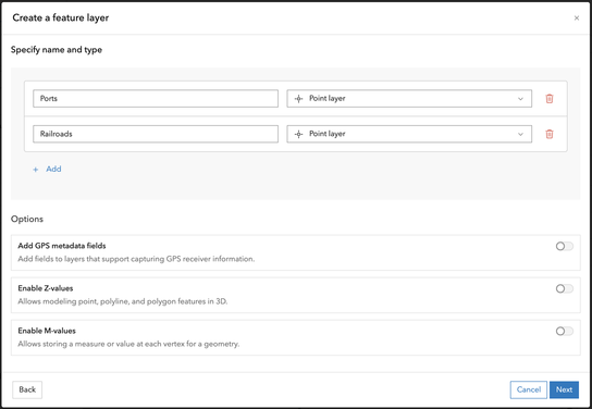
- Under “Specify name and type” Add Lines and Points as the geometry type and name the layers
PortsandRailroads
- Click Next, and name the dataset french_ports_railroads_[your initials or SUNetID]
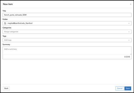
- Click Save.
Step 3: Customize the Data Schema
At this point, you should be redirected to the Details Page for the french_ports_railroads_SUNetID layer.
Adding Fields (Columns)
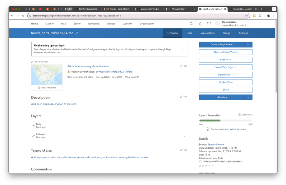
- Click on Data at the top of the Details Page.
- Confirm that
Layer:Portsis selected in the Layer dropdown, and click on Fields to view the Fields panel.

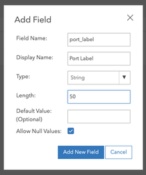
- Click on the +Add Button and use the following image to fill the Add Field dialog.
- Repeat the previous step to add and define the following fields for the dataset (note that you will change to the Railroads Layer and add it’s new fields):
| Field Name | Data Type | Length | Description |
|---|---|---|---|
port_label |
Text | 50 | Name or identifier for the port. |
port_type |
Text | 50 | Classification of the port (major/minor). |
railroad_label |
Text | 50 | Name or identifier for the railroad. |
notes |
Text | 255 | Additional observations or comments (both layers). |
Step 4: Create a Controlled Vocabulary List for a Field (Domain)
What is a Domain?
A domain is a predefined list of acceptable values for a specific field in your database. For example, instead of allowing someone to type “BIG PORT,” “big port,” or “port-major” (three different spellings of the same thing), a domain forces them to select from a standardized list: Major or Minor. This ensures data consistency and quality—critical for any GIS project.
To standardize the input for port_type, create a domain with controlled vocabulary:
- From the Data > Fields page in the feature layer Details for the
Portslayer, click on theport_typefield value to open its details page. - Click on Create List and create the following values:
- Major
- Minor
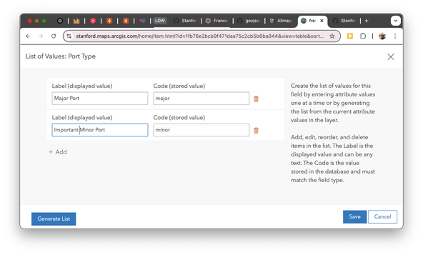
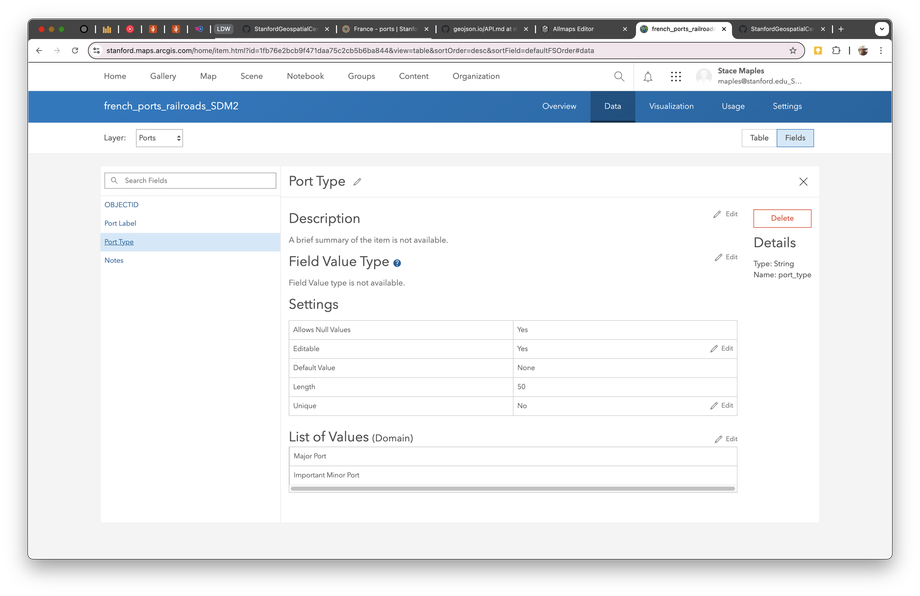
- Click Save to assign this list (domain) to the
port_typefield.
Step 5: Create a Map
What is a Map?
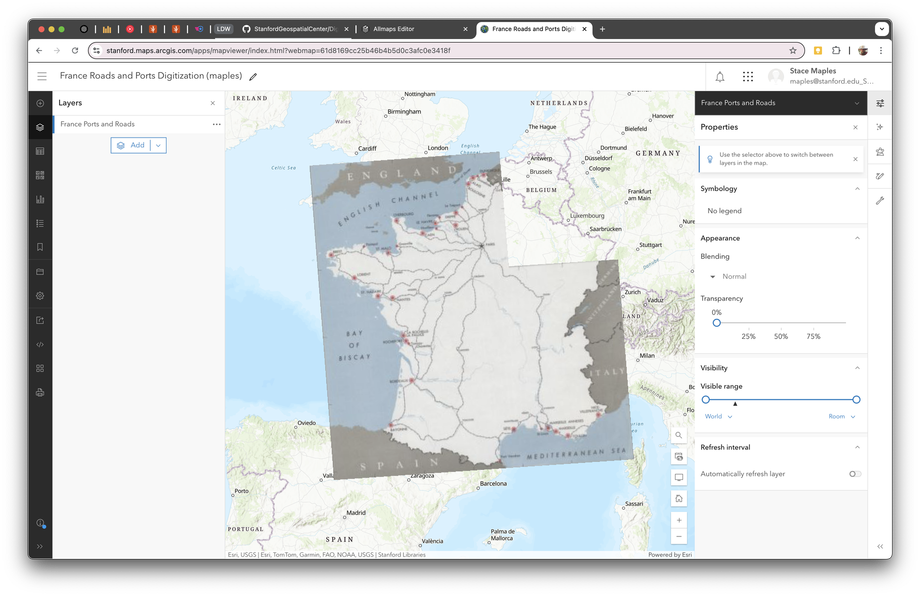
In ArcGIS, a map is a visualization that combines multiple layers of data displayed together. Think of it like a stack of transparent sheets, each showing different information. Your map will have two layers: the XYZ tile layer (the historical map image) underneath, and your digitization data (ports and railroads) on top. Maps are the containers where data comes to life visually.
- Click Map in the ArcGIS Online menu.
- Click Add → Add Layer from URL.
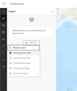
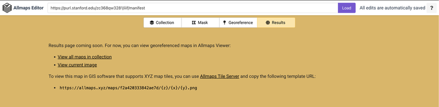
- Paste the XYZ tile URL generated from the IIIF manifest (This can be found on the Results page of the Allmaps Editor for the map we are working with).
- Alternatively, you can use this link:
https://allmaps.xyz/maps/560151a07e32b2e1/{z}/{x}/{y}.png
- Confirm
Type: Tile Layeris automatically detected after the paste.
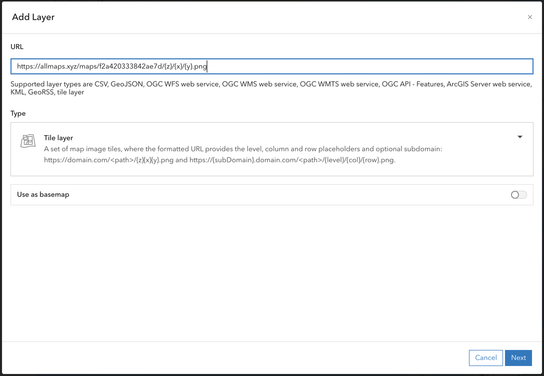
- Click Next
- Give your layer a Title and Attribution
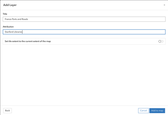
- Click Add to map.
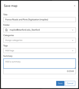
- Save your map as
France Roads and Ports Digitization (SUNetID)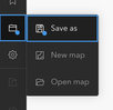
Step 6: Add the Feature Layer for Digitization
- Click Add → Browse Layers.
- Select My Content and find french_ports_railroad_[SUNetID]s.
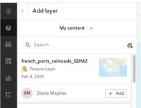
- Click +Add.
- Click the
 Arrow at the top of the panel to close it
Step 7: Configure Symbology
What is Symbology?
Symbology refers to the visual appearance of features on your map—colors, sizes, line styles, etc. Unique symbols means each category of a feature (like “Major Port” vs. “Minor Port”) gets a different appearance, making them visually distinct. This helps you and others see patterns at a glance. When digitizing, use contrasting colors so you can easily see what you’ve completed versus what remains.
- Click on the small arrow next to the french_ports_railroads layer to expand it.
- Select the Ports layer
- Select Edit layer style in the resulting Properties Panel, on the right.
- Click on +Field and check the box next to
Port Type
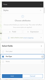
- Click Add
- In the Pick a style dialog, click on Style options for the Types (unique symbols)
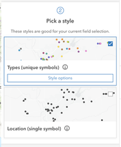
- Configure symbology for:
- Ports: Use unique symbols based on
port_type(e.g., 10pt green circle for major ports, 6pt blue circle for minor ports). You want to use a color scheme that contrasts with the features in the map you are digitizing, so that you can easily see your progress. You can change the symbology for your final map later, but for now you want something visible.
- Ports: Use unique symbols based on
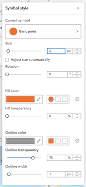
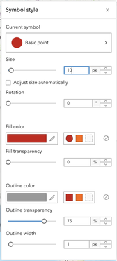
- Click Done and Done to save the changes and dismiss the Properties panel.
-
Return to the Layers Panel on the left and configure the symbology for the
Railroadsfeature layer- Railroads: Use a dashed line for railroads.
- Save your configuration.

Step 8: Configure Popups
What are Popups?
Popups are small information windows that appear when you click on a feature in your map. They display the attributes (data fields) associated with that feature. By configuring which fields appear in popups, you control what information users see when they interact with your map.
- Click on the Port feature layer to open the Properties panel.
- Click on the Pop-ups button.
- Expand the Fields list and confirm the following fields:
port_labelport_typenotes
- Drag and Drop the Fields to rearrange them, if needed.
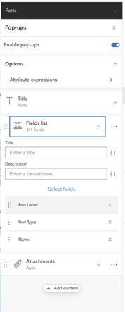
- Click on the Railroads feature layer and confirm the following fields:
railroad_labelNotes
- Click on the X to remove the
Shape_Lengthfield from the pop-up - Save the changes to your Map.
Step 9: Create an Interactive Editing App
What is an Instant App?
An Instant App is a prebuilt web application template from Esri (the company behind ArcGIS) that you can customize without coding. It lets you access and edit your map data from any web browser, without needing to purchase expensive GIS software.
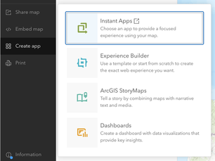
- Click Create app → Instant Apps.
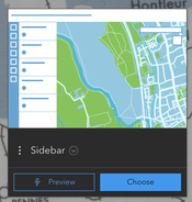
- Click on Choose on the Sidebar App Template.
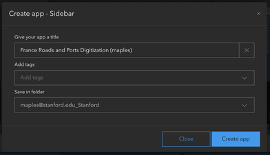
- Fill out the Create app - Sidebar dialog and click Create app.
- Configure the app:
- Click on the Search settings button and use
editas the search term. - Click on Edit tools and click Continue to exit Express Mode and continue configuring your app.
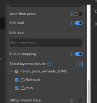
- Toggle on Edit tools for adding and modifying features.
- Expand the french_ports_railroads_SUNetID layer and check the boxes for
RailroadsandPorts. - Configure the attribute editor to use dropdown menus for
port_type.
- Click on the Search settings button and use
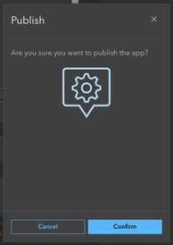
- Click Publish and Confirm to save and publish the app.
Step 10: Digitize Your Features
What is Digitizing?
Digitizing is the process of converting features from a map image into structured geospatial data your computer can understand. When you click on a port location, you’re creating a point feature with defined coordinates. When you trace a railroad line, you’re creating a line feature. Each feature gets associated attributes (like “port_label” or “port_type”) that describe it.
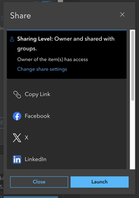
- Click the Launch button to open your app.
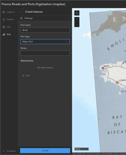
- Click on the Edit button to open the Editor Tool Panel.
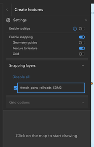
- Select the Ports template icon and place it on one of the ports in your map.
- Add the Port Label (what is the port called?).
- Use the Port Type dropdown to select either
MajororMinor. - Click Create to save the feature.
- Continue digitizing the ports until you have completed the task (or practice for a bit).
- Click the Back arrow to return to the Editor Tools main panel.
Step 11: Export Digitized Data to GeoJSON
What is GeoJSON?
GeoJSON is a standardized text format for storing geospatial data that any GIS software can read. It’s based on JSON (JavaScript Object Notation), a universal data format used across the internet. When you export to GeoJSON, your digitized features (ports and railroads) are converted into a file that you can download, edit in other GIS software like QGIS, or share with collaborators.
What is a Hosted Feature Layer?
A hosted feature layer is a dataset stored on ArcGIS Online’s cloud servers. Unlike shapefiles or databases stored on your computer, hosted feature layers are always accessible from anywhere via the web, anyone you share them with can access them, and you can easily track edits and versions. When you export to GeoJSON, you’re downloading a copy of this data in a portable format.
- Open https://stanford.maps.arcgis.com in your browser and navigate to Content to find the french_ports_railroads layer.
- Find your french_ports_railroads_SUNetID Feature Layer (hosted), and click on it to navigate to the Details page for the data.

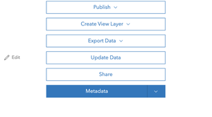
- Click Export Data → GeoJSON.
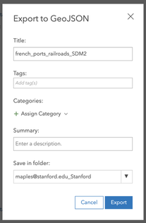
- Fill out the Export to GeoJSON dialog and click Export.
- On the resulting Details page, click on the Share button, change access to
Public, and click Save.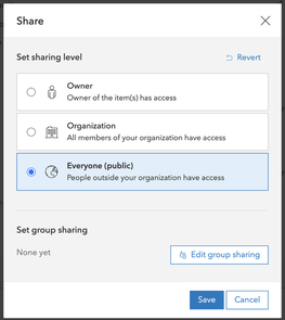
- Download the exported file for use in other GIS applications.
Conclusion
By the end of this exercise, you will have digitized the major and minor ports and railroads from the historical map and exported your work as geospatial data. Your data will be standardized, exportable, and ready for analysis or integration into other projects.
🚀 Happy Mapping!