Step 6: Split-Screen Layout with External CSS
Live Demo: html/cog_map_step_06.html
Overview
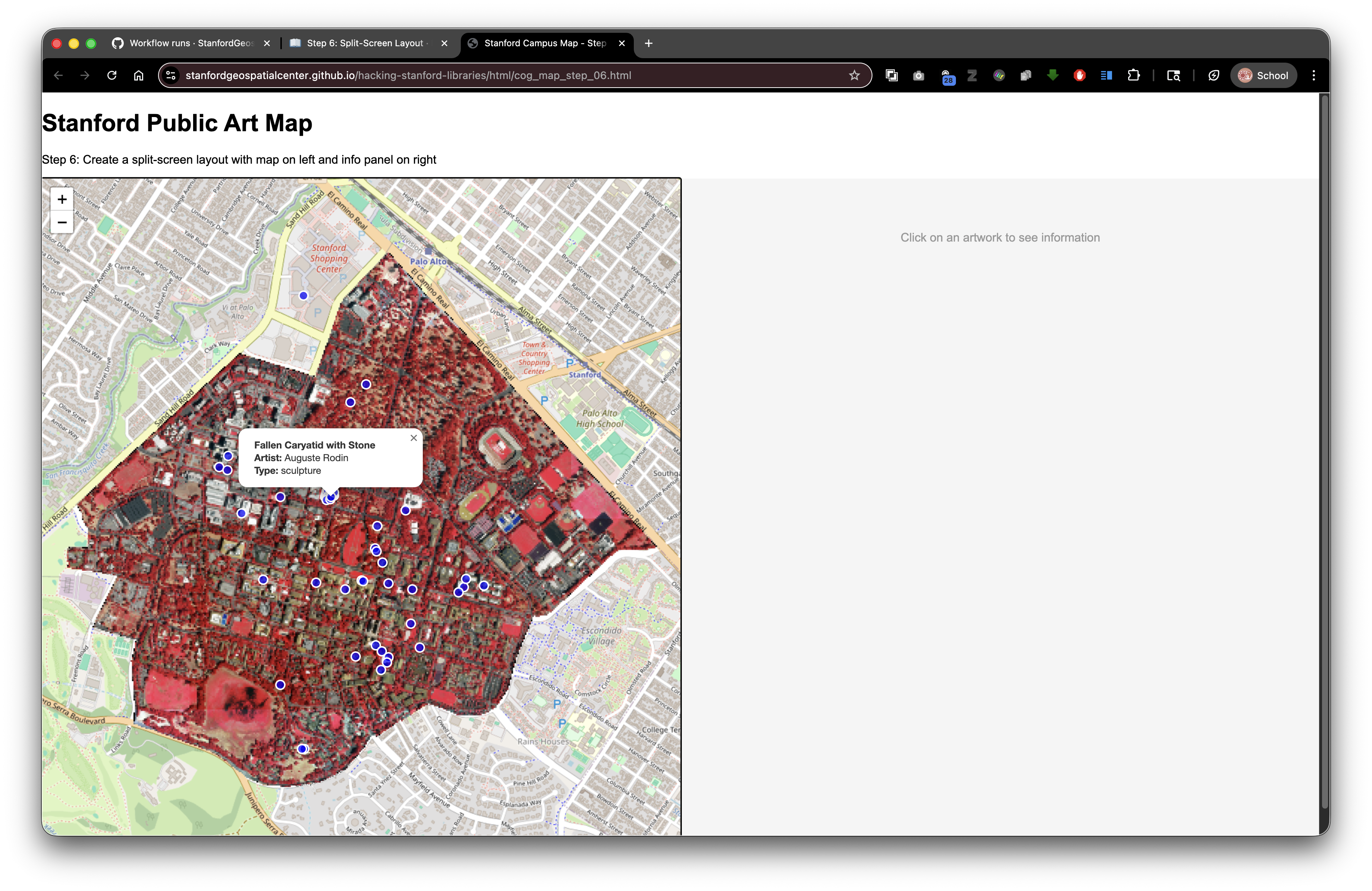
In this step, we'll reorganize our page layout and move our styling to an external CSS file. This creates a professional split-screen interface with the map on the left and space for information on the right.
Learning Objectives
- Create an external CSS file
- Link stylesheets to HTML documents
- Build flexbox layouts for responsive design
- Understand CSS selectors and specificity
- Separate structure (HTML) from presentation (CSS)
Why Use External CSS?
Benefits:
- Reusable - One CSS file can style multiple HTML pages
- Maintainable - Changes in one place affect all pages
- Organized - Keeps HTML clean and focused on content
- Cacheable - Browsers can cache CSS, making pages load faster
- Collaborative - Designers can work on CSS while developers work on HTML
Think of it like: Having a style guide (CSS file) that all your documents (HTML files) follow.
The External CSS File (styles_wikidata.css)
First, let's create our stylesheet. Save this as styles_wikidata.css:
/*
    styles_wikidata.css
    Styling for the Stanford Public Art Map with Wikidata integration
*/

/* Base styles for HTML and body elements */
html, body {
    height: 100%;
    margin: 0;
    font-family: Arial, sans-serif;
}

/* Main container that creates the split-screen layout using flexbox */
#container {
    display: flex;
    height: calc(100% - 80px);
}

/* Left side: map wrapper takes up 50% of the width */
#mapWrapper {
    width: 50%;
    height: 100%;
}

/* Leaflet map container takes full size of its parent wrapper */
.leaflet-container {
    height: 100%;
    width: 100%;
}

/* Right side: Wikidata information panel takes up 50% of the width */
#wikidata-panel {
    width: 50%;
    height: 100%;
    overflow-y: auto;
    padding: 20px;
    background-color: #f5f5f5;
    border-left: 2px solid #ddd;
    box-sizing: border-box;
}

/* Container for Wikidata content with white background and subtle shadow */
.wikidata-content {
    background: white;
    padding: 20px;
    border-radius: 5px;
    box-shadow: 0 2px 4px rgba(0,0,0,0.1);
}

/* Styling for Wikidata images - constrain size and add spacing */
.wikidata-image {
    max-width: 100%;
    max-height: 300px;
    margin: 10px 0;
    border-radius: 5px;
}

/* Main title/label for the artwork from Wikidata */
.wikidata-label {
    font-size: 24px;
    font-weight: bold;
    margin: 10px 0;
    color: #333;
}

/* Description text from Wikidata with improved readability */
.wikidata-description {
    font-size: 14px;
    color: #666;
    margin: 10px 0;
    line-height: 1.5;
}

/* Container for individual properties (artist, date, material, etc.) */
.wikidata-property {
    margin: 10px 0;
    font-size: 13px;
}

/* Labels for property names (e.g., "Artist:", "Date:", "Material:") */
.wikidata-property-label {
    font-weight: bold;
    color: #333;
}

/* Styling for external links to Wikidata */
.wikidata-link {
    color: #0066cc;
    text-decoration: none;
}

/* Hover state for links - add underline on hover */
.wikidata-link:hover {
    text-decoration: underline;
}

/* Message shown when no artwork is selected */
#no-selection {
    color: #999;
    text-align: center;
    padding-top: 50px;
}
The HTML File (cog_map_step_06.html)
<!DOCTYPE html>
<html lang="en">
<head>
<base target="_top">
<meta charset="utf-8">
<meta name="viewport" content="width=device-width, initial-scale=1">
<title>Stanford Campus Map - Step 6: Split Layout with External CSS</title>
<!-- Leaflet CSS for mapping library -->
<link rel="stylesheet" href="https://unpkg.com/leaflet@1.9.4/dist/leaflet.css" integrity="sha256-p4NxAoJBhIIN+hmNHrzRCf9tD/miZyoHS5obTRR9BMY=" crossorigin=""/>
<!-- Leaflet JS for mapping functionality -->
<script src="https://unpkg.com/leaflet@1.9.4/dist/leaflet.js" integrity="sha256-20nQCchB9co0qIjJZRGuk2/Z9VM+kNiyxNV1lvTlZBo=" crossorigin=""></script>
<!-- Projection library for geospatial coordinate transformations -->
<script src="https://unpkg.com/proj4"></script>
<!-- GeoRaster library for reading raster data -->
<script src="https://unpkg.com/georaster"></script>
<!-- GeoRaster Layer plugin for Leaflet to display rasters -->
<script src="https://unpkg.com/georaster-layer-for-leaflet"></script>
<!-- External CSS file with all styling for the split-screen layout -->
<link rel="stylesheet" href="styles_wikidata.css">
</head>
<body>
<!-- Page heading -->
<h1>Stanford Public Art Map</h1>
<!-- Step description -->
<p>Step 6: Create a split-screen layout with map on left and info panel on right</p>
<!-- Main container divided into two sections: map and info panel -->
<div id="container">
<!-- Left side: map wrapper contains the Leaflet map -->
<div id="mapWrapper">
<div id="map"></div>
</div>
<!-- Right side: Wikidata information panel (empty for now) -->
<div id="wikidata-panel">
<div id="no-selection">Click on an artwork to see information</div>
</div>
</div>
<script>
// Initialize the Leaflet map object centered on Stanford campus
const map = L.map('map').setView([37.427, -122.169], 15);
// Add OpenStreetMap basemap tiles to the map
const tiles = L.tileLayer('https://tile.openstreetmap.org/{z}/{x}/{y}.png', {
maxZoom: 19,
attribution: '© <a href="http://www.openstreetmap.org/copyright">OpenStreetMap</a>'
}).addTo(map);
// Load and display the Cloud Optimized GeoTIFF (COG) raster layer
var url_to_geotiff_file = new URL("collection/stanford_campus_irg.tif", window.location.href).href;
parseGeoraster(url_to_geotiff_file).then(georaster => {
console.log("georaster:", georaster);
fetch("collection/stanford_campus.geojson")
.then(r => r.json())
.then(maskGeojson => {
var layer = new GeoRasterLayer({
attribution: "Planet",
georaster: georaster,
resolution: 128,
mask: maskGeojson
});
layer.addTo(map);
map.fitBounds(layer.getBounds());
});
}).catch(console.error);
// Load the public art GeoJSON file
fetch('collection/stanford_public_art.geojson')
.then(response => response.json())
.then(data => {
const artworkLayer = L.geoJSON(data, {
pointToLayer: function(feature, latlng) {
return L.circleMarker(latlng, {
radius: 6,
color: 'white',
weight: 2,
fillColor: 'blue',
fillOpacity: 0.7
});
},
onEachFeature: function(feature, layer) {
const props = feature.properties || {};
const title = props.name || 'Artwork';
const artist = props.artist_name;
const type = props.artwork_type;
let popupContent = '<div style="min-width:200px;">';
popupContent += '<b>' + title + '</b><br>';
if (artist) popupContent += '<b>Artist:</b> ' + artist + '<br>';
if (type) popupContent += '<b>Type:</b> ' + type;
popupContent += '</div>';
layer.bindPopup(popupContent);
}
}).addTo(map);
map.fitBounds(artworkLayer.getBounds());
})
.catch(error => console.error('Error loading GeoJSON:', error));
</script>
</body>
</html>
What's New?
1. Linking the External CSS File
<link rel="stylesheet" href="styles_wikidata.css">
Breaking it down:
<link>- HTML tag for linking external resourcesrel="stylesheet"- Tells browser this is a CSS filehref="styles_wikidata.css"- Relative path to the CSS file
This is a relative path! The CSS file should be in the same folder as your HTML file:
your-project/
├── cog_map_step_06.html
└── styles_wikidata.css
In Digital Stacks (after SDR deposit):
https://stacks.stanford.edu/file/druid:abc123xyz456/
├── index.html
└── styles_wikidata.css
The relative reference continues to work!
2. The Split-Screen Container Structure
<div id="container">
    <div id="mapWrapper">
        <div id="map"></div>
    </div>
    <div id="wikidata-panel">
        <div id="no-selection">Click on an artwork to see information</div>
    </div>
</div>
Three layers of nesting:
#container- The main wrapper using flexbox#mapWrapperand#wikidata-panel- Two flex children (left and right sides)#mapand content - The actual map and information go inside these
Why the nesting? Separates layout (container) from content (map, info panel).
Understanding the CSS
Flexbox Layout
#container {
    display: flex;
    height: calc(100% - 80px);
}
display: flex - Turns this element into a flex container
What flexbox does:
- Arranges children side-by-side (by default)
- Makes equal-height columns easy
- Handles responsive layouts well
- Automatically distributes space
height: calc(100% - 80px) - CSS calculation
Breaking it down:
100%- Full height of the browser window-80px- Subtract space for the heading and descriptioncalc()- CSS function that does math
The 50/50 Split
#mapWrapper {
    width: 50%;
    height: 100%;
}

#wikidata-panel {
    width: 50%;
    height: 100%;
    overflow-y: auto;
    padding: 20px;
    background-color: #f5f5f5;
    border-left: 2px solid #ddd;
    box-sizing: border-box;
}
Both are 50% wide - Creates the split-screen effect
overflow-y: auto - Add a scrollbar if content is too tall
box-sizing: border-box - Include padding in the width calculation
Without box-sizing:
Total width = 50% + 20px padding left + 20px padding right
             = More than 50% → Layout breaks!
With box-sizing: border-box:
Total width = 50% (including padding)
            = Exactly 50% → Layout works!
CSS Selectors
ID Selector (targets one specific element):
#container { }
Matches: <div id="container">
Class Selector (targets all elements with a class):
.wikidata-label { }
Matches: <div class="wikidata-label">, <span class="wikidata-label">, etc.
Element Selector (targets all elements of a type):
body { }
Matches: <body>
Multiple Selectors:
html, body { }
Matches both <html> and <body>
Colors in CSS
color: #333;              /* Dark gray (hex code) */
background-color: #f5f5f5; /* Light gray (hex code) */
border-left: 2px solid #ddd; /* Very light gray border */
Hex color codes:
#RRGGBB- Red, Green, Blue values in hexadecimal#000000- Black (no color)#FFFFFF- White (all colors)#FF0000- Pure red#333333- Dark gray (can be shortened to#333)
Alternative color formats:
color: rgb(51, 51, 51);           /* RGB values (0-255) */
color: rgba(51, 51, 51, 0.5);     /* RGB with alpha (transparency) */
color: hsl(0, 0%, 20%);           /* Hue, Saturation, Lightness */
color: red;                        /* Named colors */
Box Shadow
box-shadow: 0 2px 4px rgba(0,0,0,0.1);
Creates a subtle shadow effect
Format: horizontal vertical blur color
0- No horizontal offset2px- 2 pixels down4px- 4 pixels of blurrgba(0,0,0,0.1)- Black with 10% opacity (very faint)
Border Radius
border-radius: 5px;
Rounds the corners - Creates softer, more modern appearance
Hover States
.wikidata-link:hover {
    text-decoration: underline;
}
:hover - A pseudo-class that activates when the mouse is over the element
Use for:
- Visual feedback
- Indicating clickability
- Enhancing user experience
CSS Comments
/* This is a CSS comment */

/*
   Multi-line comments
   can span multiple lines
*/
Good practice: Comment your CSS to explain:
- What sections are for
- Why certain values were chosen
- How styles work together
File Organization for SDR
Recommended structure:
your-sdr-deposit/
├── index.html
├── styles_wikidata.css
├── collection/
│   ├── stanford_public_art.geojson
│   ├── stanford_campus.geojson
│   └── stanford_campus_irg.tif
└── README.md
All references use relative paths:
In HTML:
<link rel="stylesheet" href="styles_wikidata.css">
<script src="js/app.js"></script>
In CSS (if you had images):
background-image: url('images/background.jpg');
After deposit with DRUID abc123xyz456:
- HTML:
https://stacks.stanford.edu/file/druid:abc123xyz456/index.html - CSS:
https://stacks.stanford.edu/file/druid:abc123xyz456/styles_wikidata.css - Everything works automatically!
Try It Yourself
- Create
styles_wikidata.csswith the CSS code above - Create
cog_map_step_06.htmlwith the HTML code above - Make sure both files are in the same folder
- Open the HTML file in your browser
You should see:
- The map on the left side
- A gray panel on the right side
- A message saying "Click on an artwork to see information"
Experiments
Change the split ratio (70% map, 30% info):
#mapWrapper {
    width: 70%;
}

#wikidata-panel {
    width: 30%;
}
Change colors:
#wikidata-panel {
    background-color: #e3f2fd;  /* Light blue */
    border-left: 3px solid #2196f3;  /* Bright blue */
}
Add a transition effect:
.wikidata-link {
    color: #0066cc;
    text-decoration: none;
    transition: all 0.3s ease;
}

.wikidata-link:hover {
    text-decoration: underline;
    color: #0052a3;
    transform: scale(1.05);
}
Responsive Design Considerations
For mobile devices, you might want to stack vertically instead of side-by-side:
@media (max-width: 768px) {
    #container {
        flex-direction: column;
    }

    #mapWrapper, #wikidata-panel {
        width: 100%;
        height: 50%;
    }
}
@media - Media query that applies styles based on screen size
What's Next?
In Step 7: Basic Wikidata Fetching, we'll start filling that right panel with data from Wikidata!
Key Takeaways
- External CSS files keep HTML clean and styles reusable
- Use relative paths for CSS files in SDR deposits
- Flexbox creates flexible, responsive layouts
box-sizing: border-boxmakes width calculations predictable- ID selectors target specific elements, class selectors target groups
- CSS comments document your styling decisions
- Hover states improve user experience
Common Questions
Q: Can I have multiple CSS files?
A: Yes! Link multiple files in order:
<link rel="stylesheet" href="base.css">
<link rel="stylesheet" href="layout.css">
<link rel="stylesheet" href="theme.css">
Q: What if my CSS doesn't work?
A: Check the browser console (F12) for errors. Verify the file path is correct and the file exists.
Q: Why use external CSS instead of inline styles?
A: Cleaner HTML, reusable styles, better performance (caching), easier maintenance.
Q: Can I override external CSS with inline styles?
A: Yes, inline styles have highest priority (specificity). But it's better to add classes and modify the CSS file.
Previous: Step 5: COG from Digital Stacks | Next: Step 7: Basic Wikidata